Code
np_data <- read.csv("https://raw.githubusercontent.com/melaniewalsh/responsible-datasets-in-context/main/datasets/national-parks/US-National-Parks_RecreationVisits_1979-2024.csv",
stringsAsFactors = FALSE)These exercises use National Park visitation data from 1979–2024. For more context about the dataset, see the data essay.
Concepts covered:
np_data <- read.csv("https://raw.githubusercontent.com/melaniewalsh/responsible-datasets-in-context/main/datasets/national-parks/US-National-Parks_RecreationVisits_1979-2024.csv",
stringsAsFactors = FALSE)View the np_data dataframe by clicking on the spreadsheet icon in the Global Environment
library("dplyr")
library("stringr")
library("ggplot2")
library("scales")First, filter the dataframe for a park of your choice. Then, pick a National Park that you haven’t worked with yet, and filter the data for only that park.
my_parks_df <- np_data %>%
  filter(ParkName == "Mount Rainier NP")

head(my_parks_df) | ParkName | Region | State | Year | RecreationVisits |
|---|---|---|---|---|
| Mount Rainier NP | Pacific West | WA | 1979 | 1516703 |
| Mount Rainier NP | Pacific West | WA | 1980 | 1268256 |
| Mount Rainier NP | Pacific West | WA | 1981 | 1233671 |
| Mount Rainier NP | Pacific West | WA | 1982 | 1007300 |
| Mount Rainier NP | Pacific West | WA | 1983 | 1106306 |
| Mount Rainier NP | Pacific West | WA | 1984 | 1152411 |
Now, make a line plot that shows the number of visits per year to that park from 1979 to 2022.
Choose a color for the line.
Give the plot a title that also functions as a kind of “headline” for the most interesting story of the plot.
Change the x-axis ticks so that they increase 5 years at a time.
Change the y-axis tick labels so that they abbreviate millions to M and thousands to K.
ggplot(my_parks_df) +
  geom_line(aes(
    x = Year,
    y = RecreationVisits
  ),
  color = "green") +
  scale_x_continuous(
    breaks = seq(from = 1980, to = 2020, by = 5),
  ) +
  scale_y_continuous(labels = label_number(scale_cut = cut_short_scale()),
  limits = c(0, 2000000)) +
  labs(title = "Visits to Mt. Rainier Are Surprisingly Stable")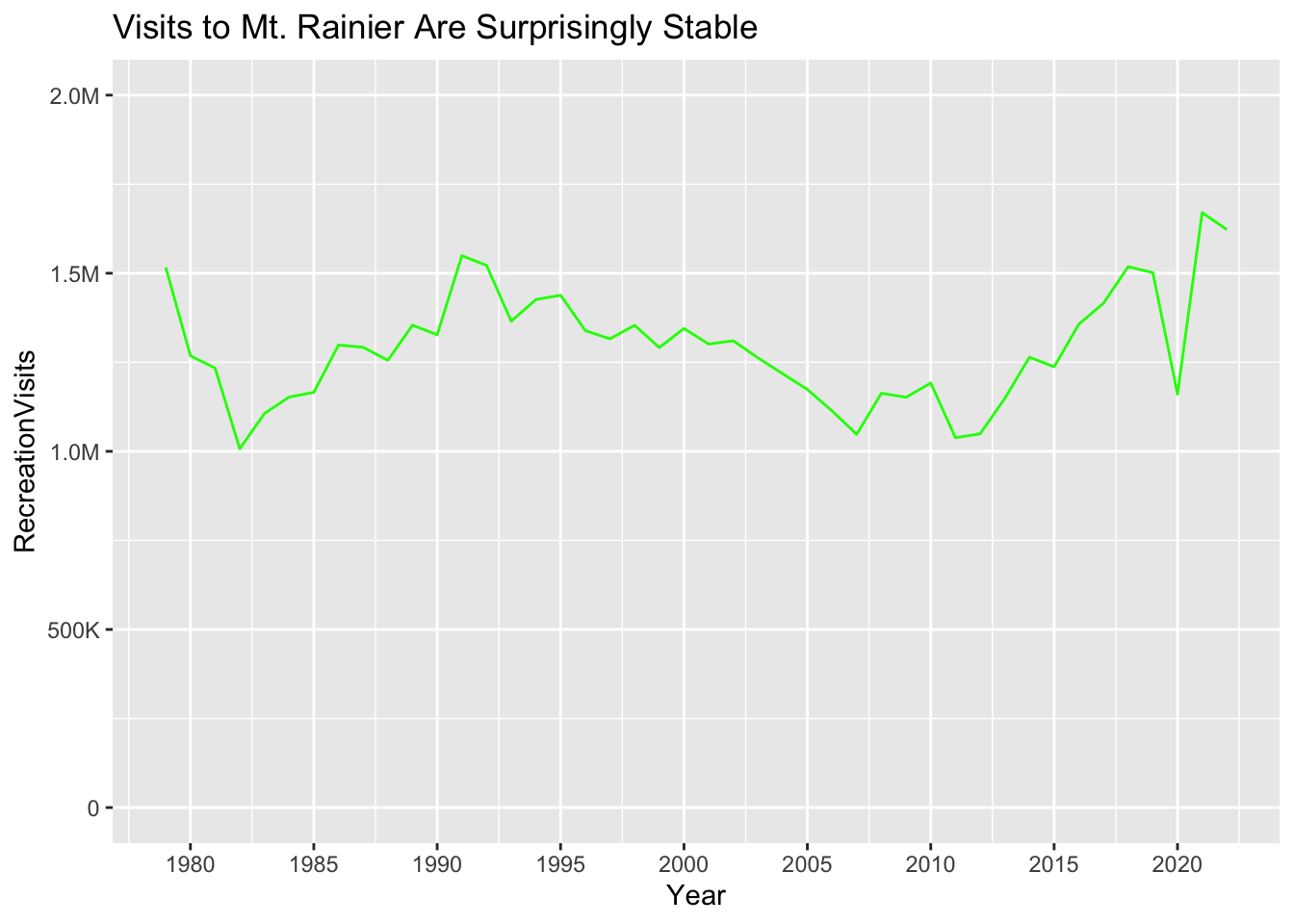
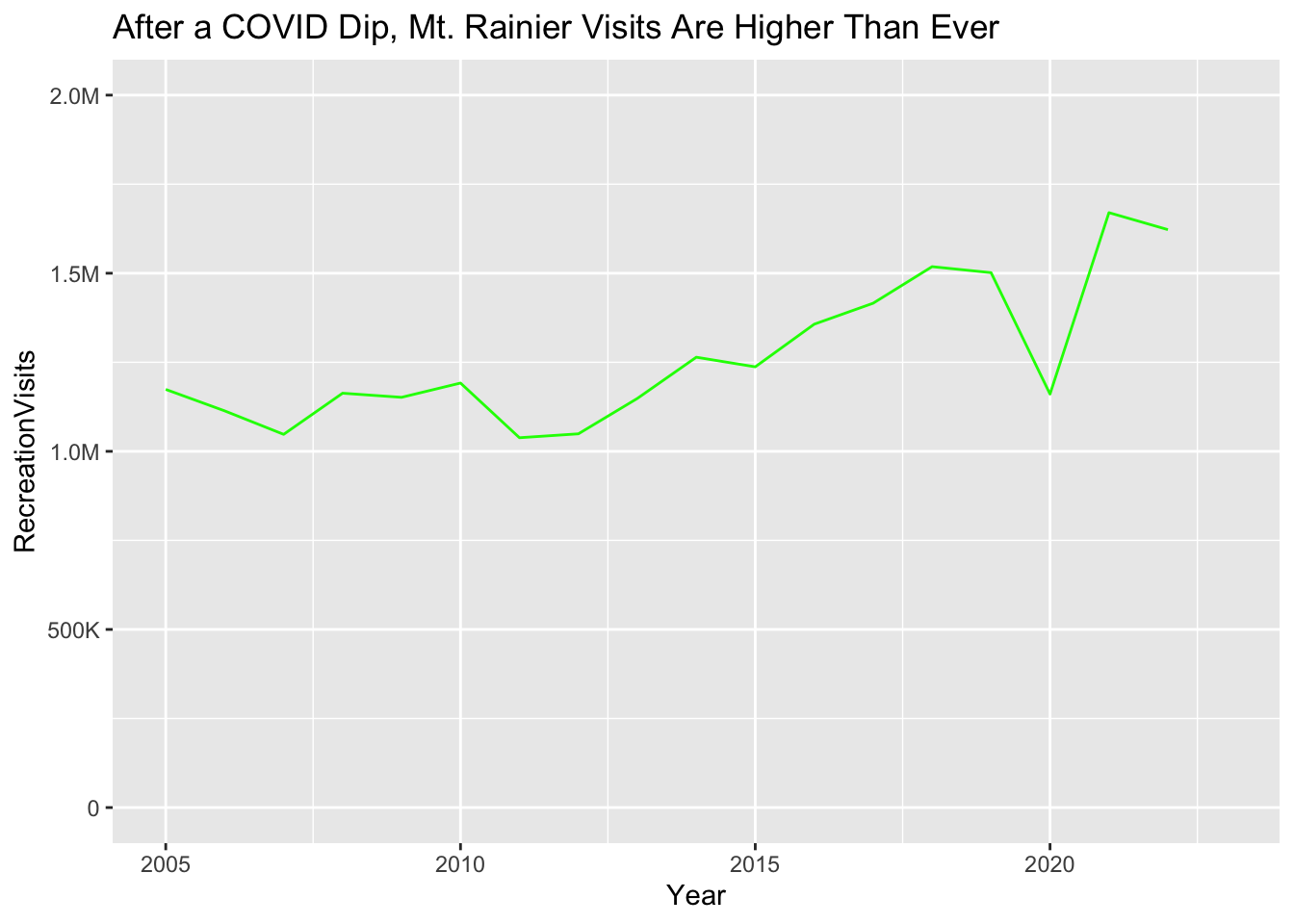
Now, create a plot that zooms in on the most interesting time period for this particular National Park.
Change the x-axis limits so that it only shows the most interesting years.
Come up with a new title that describes this time period.
ggplot(my_parks_df) +
  geom_line(aes(
    x = Year,
    y = RecreationVisits
  ),
  color = "green") +
  scale_x_continuous(
    breaks = seq(from = 1980, to = 2020, by = 5),
    limits = c(2005, 2023),
  ) +
  scale_y_continuous(labels = label_number(scale_cut = cut_short_scale()),
   limits = c(0, 2000000)) +
  labs(title = "After a COVID Dip, Mt. Rainier Visits Are Higher Than Ever")